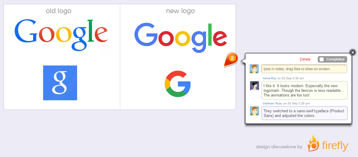
Today Google changed its logo and other branding elements to a more modern look. It is a much more geometric and bold design with a san-serif typeface.
SitePoint published a great review in today’s newsletter and Google Design team blogged about how the changes evolved and the reasoning behind them.
