Whoever started the trend (later made popular by Google), today the default user avatars are usually represented by their name initials inside a colored circle.
While redesigning avatars for smartQ workflow management tool, we decided to spice it up a bit by adding a simple background pattern to the colored avatar circles. Here is the result:
We started with a low poly background, to keep the design flat and modern. There are many tools for creating low poly art. SVG was our format of choice as a vector format, so it’s retina-friendly and scales nicely.
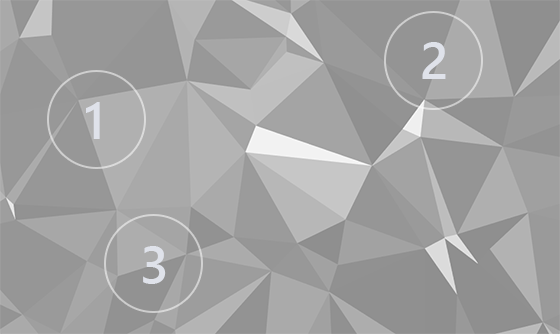
We did not want the pattern to be the same for each avatar, so we started with a larger polygonal frame, then applied a circle mask to it. By moving the mask coordinates an infinite number of background variations can be created:

Grayscale polygonal vector background
We started with a grayscale background and added colors to it via a color layer on top of the polygon background, then we blended it using CSS Blend Modes. After a few experiments, we found that the “overlay” mode worked the best (mix-blend-mode: overlay). The result is below:
See the Pen Default avatars with polygonal background by Dis (@Dis) on CodePen.light
It does not work in IE/Edge, where it simply degrades to the traditional flat color avatars.
It is a light solution, no JS involved (though it can be used to randomly generate colors and mask positions). It also does not add much to the download time, since low-poly SVGs are small (you can also use a smaller SVG frame, compress it, and even use background rotation for more avatar background variations).
The resulting default avatars look familiar, yet have a new element to them.
