≡ Menu

New FireFly (v2) is out!

We have been working hard redesigning FireFly from scratch for some time now. And today the new version has been released!

Firefly v2 replaced the previous interface, and, most importantly, it does not use Flash anymore. Yes, it is still compatible with the old data, and all existing projects should open fine in the new version.

Now that the new version is out, we are looking forward to redirect our resources to improving it and adding new features.

This month, we are updating our Privacy Policy to make it easier for you to understand what information we collect about you and why we collect it.
Nothing is changing to how your information is processed. We reviewed our data collecting and protecting procedures and improved the way we describe our practices and how we explain the options you have to update, manage, export, and delete your data.

These updates are related to the new data protection regulations coming into effect in the European Union.

Please read the updated Privacy Policy and Terms of Service in full. By using our services on or after May 24, 2018, you will be agreeing to the revisions.

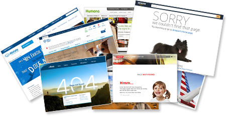
404 pagesA 404 error page is like a red headed stepchild — often neglected and, sometimes, even mistreated. After all, developers hope their website visitors will encounter it sparingly or, ideally, not at all. Because of that many web designers have fun with it.

404 error pages can be a great hidden outlet for creativity, but what if the website is the face of a big corporation? How does the corporate culture play into the mix? To answer these questions we decided to check the Fortune 500 companies 404 error pages. All of them.

Considering the resources invested into the top U.S. corporations’ websites (a safe assumption), the 404 pages should get their share of attention. It turned out it is not exactly so.

We found out that many Fortune 500 companies use generic web server 404 pagesSyscoIngram Micro, TJX Companies,  Gilead and Xerox,  to mention a few. This is a rather amazing oversight considering the little effort it takes to customize it.

The majority of the 404 pages, though, provide a directory of links to the different sections of the website for lost visitors. While predictable and safe, they are lacking, most of the time, any creativity.

Finally, a few Fortune 500 companies found a way to create practical yet original 404 pages while incorporating them into their overall brand image. Below are a few examples.
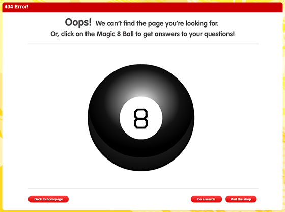
Mattel

Mattel shows a Magic 8 Ball game on their 404 error page!

Mattel’s Magic 8 Ball game idea is very playful — pun intended :-). Unfortunately, the game is made in Flash, and there is no adequate fallback provided — you will not see it on an iPad.
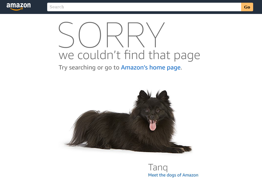
Meet he dogs of Amazon

Meet the dogs of Amazon

The Amazon giant displays random profiles of its workers dogs’. There is a link to a page listing them all alongside their favourite toys, likes and such, and even a Dogs of Amazon calendar! :-). But Amazon is not the only dog loving company out there:
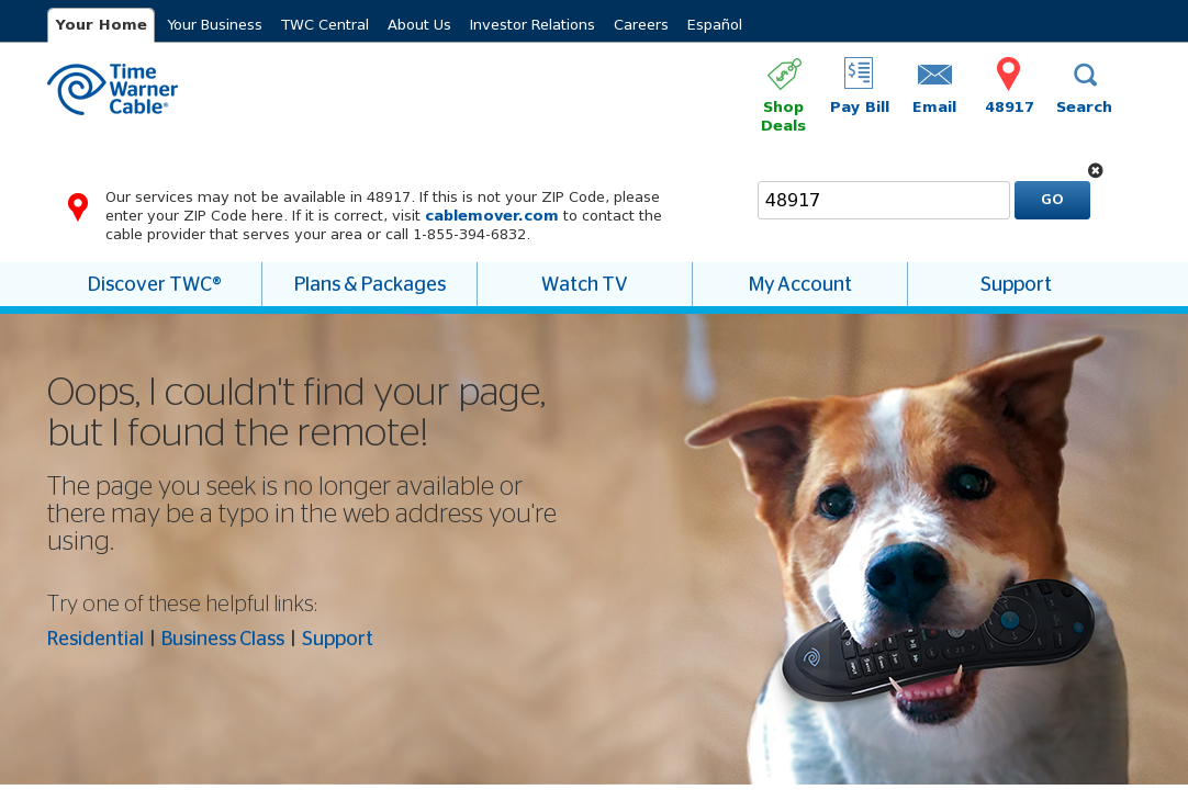
Time Warner Cable

Time Warner Cable

Dish is into plush kangaroos (with nice animation):
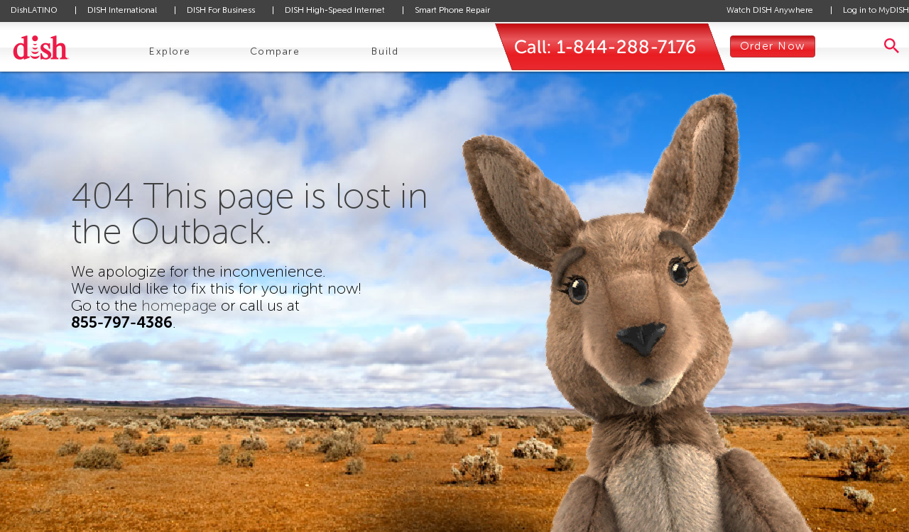
Dish Network

Dish Network

[continue reading…]

Whoever started the trend (later made popular by Google), today the default user avatars are usually represented by their name initials inside a colored circle.

While redesigning avatars for smartQ workflow management tool, we decided to spice it up a bit by adding a simple background pattern to the colored avatar circles. Here is the result:

smartQ

We started with a low poly background, to keep the design flat and modern. There are many tools for creating low poly art. SVG was our format of choice as a vector format, so it’s retina-friendly and scales nicely.

We did not want the pattern to be the same for each avatar, so we started with a larger polygonal frame, then applied a circle mask to it. By moving the mask coordinates an infinite number of background variations can be created:

Grayscale polygonal vector background

Grayscale polygonal vector background

We started with a grayscale  background and added colors to it via a color layer on top of the polygon background, then we blended it using CSS Blend Modes. After a few experiments, we found that the “overlay” mode worked the best (mix-blend-mode: overlay). The result is below:

See the Pen Default avatars with polygonal background by Dis (@Dis) on CodePen.light

It does not work in IE/Edge, where it simply degrades to the traditional flat color avatars.

It is a light solution, no JS involved (though it can be used to randomly generate colors and mask positions). It also does not add much to the download time, since low-poly SVGs are small (you can also use a smaller SVG frame, compress it, and even use background rotation for more avatar background variations).

The resulting default avatars look familiar, yet have a new element to them.

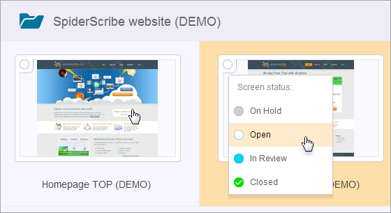
We just added statuses to screens — “Open”, “On Hold”, ‘In Review” and “Closed”. You can also filter screens by statuses.

Screen Status

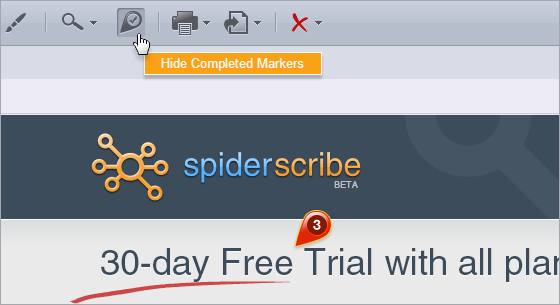
Also, now you can easily hide the closed (completed) design comment from a screen:

Hide closed design comments

Firefly update: Archive projects

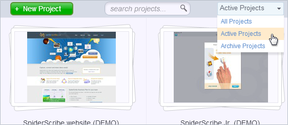
Archive

We just added the possibility to archive projects and switch between all/active/archived projects view.

We just released a big batch of updates we have been working on for some time.

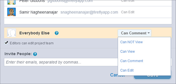
The security for projects has been extended with Everybody Else role to make setting the access level for non-team members easy. For example, now you do not need to add people to the project team just to let them post comments into it!
Everybody Else

We also added the integration with all popular cloud storage services. Now you can post new screens or attach files to notes from Google Drive, Dropbox, Box and OneDrive!

Dropbox, Google Drive, Box, OneDrive integration

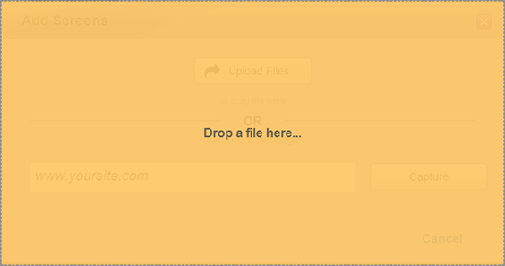
Adding files to Firefly now became easier as well with drag-and-drop upload support (not supported in Firefox right now).

Drag-and-drop support

In addition to that, we improved the highlight of new screens and notes, added the Settings section and updated a dozen of other things.

We hope you will like the updates, and, as usual, your feedback is welcomed!

Firefly Intro

We created a short 2-minute video introduction to Firefly that covers its main features. Feel free to share it with your team if they are new to Firefly!

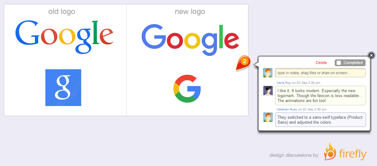
Google updates its logo

New Google Logo


Today Google changed its logo and other branding elements to a more modern look. It is a much more geometric and bold design with a san-serif typeface.

SitePoint published a great review in today’s newsletter and Google Design team blogged about how the changes evolved and the reasoning behind them.

Now you can also upload your designs in BMP format (in addition to PNG, JPG, GIF).